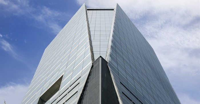
The new 86-metre glass-clad office tower at 35 Lower Long Street is characterised by a singular sculpted massing which is transformed via dynamic glazed planes that extend over the office and parking levels. The two main corners of the building are chamfered towards the roofline and soar upwards, forming a wing-like effect.

Photo supplied
The site is located in Roggebaai (Cape Town’s growing financial and hospitality precinct) and was previously occupied by an eight-storey 1980s office building which prior to that was part of the now-demolished Long Street Power Station site. While the peninsula site has three street frontages and the public domain experiences high levels of pedestrian traffic, it previously suffered from extremely limited street activation.
This was compounded by the last remaining portion of the demolished power station (Site B), hostile frontages of both the 80-metre office building to the south and dilapidated office building to the east. A fundamental component of the design concept involved maximising the activation of the street edge with retail to improve the quality and safety of the public realm, as well as to take advantage of the high levels of pedestrian traffic passing the building.
The brief
The initial brief to remodel and extend the existing 1980s building were discarded due to impractical core design, the limitations of adding floors, the need to replace an outdated façade and challenges with long-term viability.
The revised brief, by the co-owners Ellerine Bros and Abland, was to offer a more positive medium- to long-term viability, as well as to enhance Cape Town’s skyline with a decidedly taller, inspirational tower building. However, the challenge was to maximise the quality multi-tenant commercial space while accommodating core components such as lifts and stairs along with structured basement parking - all within a relatively small floor plate.
To maximise the floor plates, DHK Architects proposed a simple singular orthogonal massing bar the articulation of the southeastern and southwestern corners. While fundamentally a solid building mass, the appearance of a dynamic, non-orthogonal sculpted mass was created via tapering or cranked façade planes which extend seamlessly over the office and parking levels.
This was achieved by chamfering both the southeast and southwest corners of the building at the top of the orthogonal parking base and widening them towards the roof. The technique articulates the façade and defragments the solidity of the corners of the building as the wings shape the elevations and extend past the top office floor.
By extending the wing-shaped façade screens beyond the roof level with parapet sloping, the appearance of soaring shards is created opposed to an abrupt utilitarian termination.
Materiality
In terms of materiality, a glazed façade was selected due to its flush and sculpted reflective form which is able to conceal both the parking levels and solid spandrels. Not only does glass facilitate an exciting play of light but it allows for an expressive articulation of the building mass in the screen and shard-like elements.
The introduction of pixilation on the portions fronting the parking levels, ceiling voids, structure and internal desk height upstands allows the building to conceal both the parking levels and avoid overbearing horizontal bands.
The entire length of the street frontage along Lower Long Street and Jetty Street is enlivened with new ground-floor retail and multiple entry points into the office building. At street level, a double-volume entrance connects to shuttle lifts connecting all parking levels and the ground floor to a spectacular arrival experience within the 10th-floor sky lobby.
Thereafter, individuals are transported via a double-volume area and terrace to the office lifts which connects to all the floors above. This ensures mid-building activation and an experience for all users to enjoy as part of the arrival journey into the workspaces - encouraging interaction between different tenants.
Internal features
Internally, the building offers expansive 360-degree views over the city, ocean and mountains. The glazed façade allows for floor-to-ceiling unencumbered vistas enhanced by glazing with mullions at 2.4-metre-wide centres. The chamfered corners also offer oblique views which facilitate the appreciation of the architectural form both externally and internally - a design aspect often not apparent in tall buildings.
Furthermore, the multi-purpose roof area with terraces above both chamfered corners offers a spectacular city entertainment space and signifies high-level activation. From an external viewpoint, the perimeter desk height upstands provide ease of furnishing right against the perimeter with fire separation between the floors, therefore, the office furniture is concealed when viewed externally.
The immediate neighbour to the north and sharing a common boundary is a nine-storey 1980s building which has the potential to be redeveloped in the future. Rather than merely providing an unsightly blank common boundary façade, dhk articulated both northern corners by returning the glazing around onto the common boundary.
This is sacrificial in the sense that the neighbour could in future build higher against the common boundary. It also offers spectacular corner northern views towards Cape Town’s harbour. The solid wall concealing the stair core is pixelated with coloured plastered panels, echoing the glazed façade’s articulation.
Sustainability
Fortunately, the client championed environmental sustainability. To achieve a 4-Star GBCSA Design rating, a detailed environmental performance modelling study was undertaken. This required a high-performance double-glazed specification with increased internal cill height raised to desk height - to reduce both solar gain and radiant heat which significantly lowered HVAC requirements. Other environmental considerations included building efficiency, choice of materials, energy-efficient lighting and services, lower parking ratio encouraging the use of public transport, as well as showers and bicycle parking facilities.
“With its sleek, sculpted form and soaring-shaped facade, 35 Lower Long is an exemplar of how client requirements can be met without comprising on design standards. dhk is extremely proud of this building and views it as a catalyst for future developments to come in Cape Town’s CBD," Pierre Swanepoel, DHK partner and lead architect on the project.


