Subscribe & Follow
Jobs
- New Business Developer - Food Packaging Johannesburg
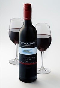
Lighter, brighter, fresher look for Two Oceans

"The more premium pack with a sleeker label is better aligned to the wines themselves. The partially see-through label on the taller bottle creates a very approachable look," says global spokesperson Jackie Olivier.
The aerial impression of the Cape Peninsula's coastline, close to where the cold Atlantic and warm Indian oceans meet, is given greater prominence, since it is a readily recognisable and important differentiator. "The brand is premised on the direct impact these two oceans have on the climate of the Western Cape and the growing conditions for its vineyards.
"Whether along the coast or further inland, the presence of the oceans is never far away. Maritime influences play an important role in grape flavour as cooling sea breezes can lower temperatures during the lead-up to the harvest, slowing down ripening to intensify fruit flavours.
"This is the rationale for the new strapline, 'crafted by the African sun and cool sea breezes'," she concludes.


