Top stories


Marketing & MediaClimate risk: A reputation test most organisations are failing
Tshepo Sefotlhelo 7 minutes


Marketing & MediaThe 702 MTN Small Business Awards returns for its 3rd year
Primedia Broadcasting 1 day
More news


Also, it probably wasn't intended that the ad would be an antidote to anti-foreigner hysteria, but that is what it was, as well as being a good marketing message.
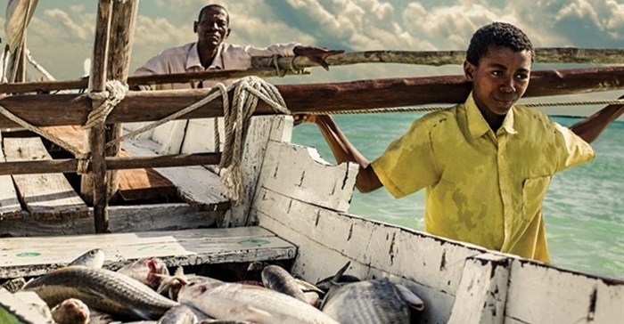
Why? Because the well-crafted advert was shot on location on an island off Madagascar and featured only actors from a small and poor fishing village. Ordinary people. Ordinary Africans.
It shows the daily struggle of a grandfather and his grandson to catch fish. Every day before dawn, the old man rouses the sleepy youngster and they drag themselves to their boat. Every day they return empty-handed. Eventually, the rest of the village gives up and looks on the two as objects of pity.
In storms and in blazing sun, they cast their nets every day. The only time the mood lightens is when the old man puts a carving - of his son and the boy's father - into the net, raising a smile.
Finally, the sight of hundreds of seabirds diving into the water shows them the shoals of fish they have been waiting for.
They return triumphant to the village and are welcomed by all. Everybody is now happy and everybody has something to eat: the food is shared, in a true expression of our overused South African term, "ubuntu".
As the ad closes we see the boy allowing the old man to sleep while he heads for the boat. He has learned well the lessons he has been taught - especially the one about going out and doing it again and again.
That's the marketing message from Prudential: Success comes from being consistent. That's what it took the old man and the boy to succeed; what it takes for your investment company to grow your wealth.
The ad is different, but it is simple and the story is appropriate to the business of investing, so Orchids to Prudential, as well as to its agency, Lowe Cape Town and production firm 0307 and director Kim Geldenhuys. Click here to view the ad.

But it doesn't end there. This is a good example of the truism that advertising has the power to change not only purchasing power, but also deeper mindsets, and can therefore be a powerful tool for social change.
I am not saying the Prudential ad will change things in this country, but it will help foster a climate in which we, as South Africans, start to respect the dignity and the struggles of the people who share this continent with us.
The village people in the ad are unsophisticated, but they have pride and they are willing to work and do whatever it takes to make a better life for themselves. There is a quiet dignity in the way they have been portrayed that is applicable to other Africans, too.
Even as I write this, I know my sub-editors' teeth will be on edge - but I can't resist it. What is the collective noun for a group of sub-editors? A mistake.
Ha ha. Seriously, folks, editors make just as many mistakes as sub-editors do and, in the end, are more culpable for any errors you see in newspapers because ultimately the buck stops with them.
The buck, apparently, was misplaced in the hallowed halls of Cricket South Africa (CSA) this week, perhaps while they were all off probing the thorny issue of: was the quota a disaster at the World Cup?
When the new Africa T20 Cup was launched with great fanfare, everybody except the honchos at CSA noticed that in the new competition logo, Africa had been incorrectly spelled as "Arfica".
There were a few embarrassed apologies from CSA and the organisation tweeted this later: "We apologize for the oversight on the #AfricaT20Cup logo. We're glad we could provide you with a good (l)arf though..."
View the apology tweet embedded below:
In no way does this undermine our effort to spread the game through the continent. Here is the correct logo. pic.twitter.com/SOxTa2RVaX
- Cricket South Africa (@OfficialCSA) April 21, 2015When any marketing campaign is put together or any brand symbol or logo is drawn up, it should be double- and triple-checked to make sure it is correct.
If this had been done in this case, the mistake would have jumped out and been corrected.
That it wasn't shows a deep sloppiness in the CSA (and remember that news organisations work to deadlines much tougher than those in the cricket governing body, so our mistakes are at least easier to understand).
You're selling us a product, CSA. That's what the millions and millions of rand in sponsorship and gate money are all about.
Your marketing sucks.
You get an Onion.
*Note that Bizcommunity staff and management do not necessarily share the views of its contributors - the opinions and statements expressed herein are solely those of the author.*
